Sunday, April 12, 2009

The Designer of the Museo Font : Jos Buivenga

If you frequent design and CSS galleries, you may have stumbled time
and time again upon an excellent typeface released last year that took
the design world by storm. I’m talking about Jos Buivenga’s font ‘Museo’.

I’ve never seen a font being adopted so quickly and fondly by web designers across the world. It’s been listed as one of the top 10 fonts of 2008 by MyFonts.com

Museo is being used everywhere, web and print. Museo Sans, its sans serif companion, was recently introduced and another style is in the works.
In this article, I’m interviewing Jos Buivenga, the author of the popular Museo font and find out more about his influential typeface, his design process and what the future holds.

Can you tell us a bit about yourself?

I was born in 1965. I live in Arnhem (the Netherlands) and work 4 days a week at an advertising agency as an art director.

My love for type design started about 15 years ago. I was playing
around on my first MAC with a very early version of Quark Xpress. While
I was doing that I kept wondering what it would be like to set a piece
of text in my very own font.

That’s how my first font family Delicious came to see the light. Every Friday (and most weekends) I dedicate my time to type design.

Every typeface I worked on was a great journey where I could really
lose myself in the creative process and for me, that’s what counts the
most.


How was Museo conceived?


Museo was conceived out of the love for one letter form. In some
kind of daydream I saw before me the letter ‘U’ with the endings bent.
So it really started with my love for the letter ‘U’.

Can you tell us a bit about the design process?

The design of Museo was fairly straight forward. I remember a few things that really determined the design…

Museo looked a bit like some piece of bent metal wire so I thought
of making the stroke contrast as low as possible and I also wanted to
keep the shapes simple like for instance a nice round geometric “O”.

Because of that stroke’s weight and because of the fact that I
wanted a fairly heavy Museo weight it seemed very difficult to me to
make a heavy lowercase.

That’s the reason why Museo was first intended to be caps only. Thanks to my blog,
Museo got a lot of attention early on. People liked it a lot and many
started to ask for a lower case version. I still had some of the very
early contours of a lowercase with a 100 weight.

I had to research what concessions I had to make to the strokes of
the heaviest weight to do this. I tried some things and I eventually
decided that if stroke changes had to be made I would make them, if
possible, in the middle of the character.

I planned 5 weights for Museo. At first, I thought of just
calculating the weights in a linear way. I made a Multiple Master of
the extreme weights and this is how I first generated the three medium
weights in the beginning.

Having a thorough look at it, it looked like the difference between
the light weights (100 - 300) was larger than the difference between
the heavy weights (700-900). So, I then decided to determine the
weights by changing them manually, and to judge them by eye.

I measured the new stems and recalculated the values so that I could
use those for generating different instances. It turned out that the
weight distribution wasn’t linear, but more like a parabolic curve.

Museo was intended from the beginning to be a display font. That is
the reason why I chose to align the ascenders with the caps height and
also aligned the diacritics with the caps height. That way a more
harmonious look is possible when diacritics are used.

Why do you think people love this font so much, what makes it so special?

That’s a secret… No, I’m just kidding. I wish I knew, but I really don’t.

Will you be extending the font or adding more weights?

I have no plans to extend Museo, but I do have plans to make a Museo Sans Rounded.

Why did you choose to have each style named with numbers like 100, 300, instead of calling them bold, extra bold, etc?

When you set a font in FontLab to the appropriate weight, next to it
appears a number. Some kind of weight indication that (I’m not sure)
seems to me is being used by some programs.

I liked the numbers so I used them as a style name. So that is wherethe 100 to 900 naming came from. I had the weird thought that if you name the different styles with numbers, people would be more willing to collect them all. What was I thinking? Who knows… maybe it worked :-)

Why do you distribute some of the styles for free?

When Museo was in the making I also had the plan to sell some of the weights. At that time I was already working 4 days a week and my goal was that I could financially compensate myself for that loss of income by selling fonts.

I tried to do that for a while with donations but that didn’t work
well enough. Because everything I had done until then was for free, I
decided that I wanted to offer more free weights than paid ones.

When I was about to release Museo, my website
attracted many unique visitors each month and I didn’t want to put all
those people off that knew me only because of my free fonts. It was
kind of a gamble to do this and almost everyone I knew told me that I
was crazy. Especially because I offered the most usable and probably
also the most wanted weights (300 - 500 - 700) for free.

What are you working on now?


I’m working very hard on Calluna and Calluna Sans. Also, I’m working on Questa which is a square typeface like Didot and something I always wanted to do. And the one I mentioned earlier: Museo Sans Rounded.


A look at ‘Museo’ around the web


Jos Buivenga runs his own Font Foundry called Exljbris and he also runs a font blog. All fonts are available for purchase at MyFonts.com

There are 5 versions to Museo, 3 of which are free and can be downloaded from MyFonts.com as well. Museo Sans is available in 10 weights, 2 of which are free. Here’s more information on how to order or download these fonts: Museo | Museo Sans

Have you used Museo in your designs? Please share your examples with us and let us know where else you spotted ‘Museo’…


sources : webdesignerdepot.com

thumb up !

tobs markotobs ...


Blogged with the Flock Browser

Tuesday, April 7, 2009

10 Steps to a Successful Design Project

Building a complete and effective website truly is a process. In this post we’ll take a brief look at the various steps that lead to a successful project. Of course, this will vary from case-to-case, but this is a pretty standard order of events.


1. Needs Analysis

I believe that it’s
important to have a good idea of what you want or need from your
website before you really get into the process. Some business owners
that decide to have a website built or redesigned
simply don’t consider exactly why they are doing it, and what they need
to get out of the final product. This is a critical first step, because
without knowing exactly where you want the project to go, it will come
up short in one way or another.

Take some time and think about
your customers and website visitors. What specifically will they need
from your website, and what style of site are they going to appreciate?
What is it that your business needs from the website?

2. Finding the Right Designer

Finding the right designer/developer
for your specific project is also critical. I feel that a needs
analysis should be done prior to choosing a designer, because the
designer that you choose should be a good fit for the needs of your
website. Many business owners simply hire a designer without really
paying attention to their strengths and weaknesses, and then they
expect to get the best results without necessarily having a good fit.

If your needs analysis shows that you need a flash-based website
, you now know that you should focus your search on designers that
specialize in building flash-based sites. Likewise, if you need a large
database-driven e-commerce site, you’re not going to want to hire a
designer who has no experience with this type of site. Some designers
and developers are able to do just about anything you need, but
everyone will have strengths and weakness that should be a part of the
decision-making process.

3. Establishment of Priorities

Once
the designer has been chosen, the client and designer should discuss
the needs of the client and establish some priorities for the project.
During this time the designer will get a feel for specifically what the
client is looking for, and ideally the discussion between the two
parties will help to create some clarity for the designer about the
appropriate direction to pursue.

4. Mockup

Now
that the designer knows what is needed, he or she can start working on
the first mockup of the site. Many designers start the process by
working in Photoshop to create a mockup, so that changes and revisions
can be made quickly, and to avoid taking the time to code something
that the client may not like. Once the mockup is complete it can be presented for feedback.

5. Implementation of Feedback

In
order to get a website that will ultimately meet the needs of your
business, you need to be involved in the process by sharing your
opinions and suggestions with the designer. No designer will know your
business or your customers like you do. There is usually a good bit of
back and forth between the designer and the client at this stage before
the project reaches the satisfaction of everyone.

6. Testing

Once
the design is pretty much in place and both the designer and the client
are satisfied, testing should begin. Throughout the earlier stages the
designer has most likely been doing some type of testing in various browsers
to be sure that the site is ok in all of the major browsers, but the
testing will often go a bit further at this point. This is a good time
for the client to also scour the site and make sure that there are no
mistakes or inaccuracies anywhere.

7. Final Design

Now
that both parties are satisfied and the necessary testing is complete,
any final changes or corrections should be made. This could be
something that resulted from testing, or just correcting some typos,
dead links, etc. At this stage the site is essentially complete.

8. Launch

Once
the site is ready to be seen by the world, the official launch should
take place. At this time the site goes live and visitors will see the
finished product. Frequently when a website is redesigned, the business
will contact existing customers or members of a mailing address to
notify them of the redesign and let them know about some new features
that are available at the site. From my experience this is an important
part of the process because you can generate some buzz from people who
are already familiar with you, and you can get a quick jump in traffic
during the first few days following the launch.

9. Marketing & Promotions

Almost
all successful websites will need to be marketed or promoted in some
way. In order to get the most out of the website, a marketing plan
should be developed. You’ve spent time and money building a great
website, now you need to get people to see it.

10. Plans for Updates/Changes/Additions

Every
website will need to be updated at some point, and some will be updated
almost constantly. How frequently will your site need to be updated and
who will be responsible for making the changes? You may want to
continue to hire the designer to perform these services, or you could
hire someone else or keep it within your company. What strategy you
choose should fit the needs of your business, but it should certainly
be considered or you’ll find yourself with outdated content on your
site a few months down the road.

What’s Your Experience?

Is there anything you would add or change from your experience?


[ vandelaydesign ]

Blogged with the Flock Browser

Saturday, March 21, 2009

Israeli Army T-Shirts Mock Gaza Killings


The printed t-shirts were discovered by an Israeli newspaper (Pic: courtesy of Yanai Yechiel)


Dominic Waghorn, Middle East correspondent

The Israeli army is at the centre of a second controversy over the moral conduct of its soldiers in as many days.


The revelations centre on t-shirt designs made for soldiers that make light of shooting pregnant Palestinian mothers and children and include images of dead babies and destroyed mosques.

The t-shirts were printed for Israeli soldiers at the end of periods of deployment or training courses and were discovered by Israeli newspaper Haaretz.

One, printed for a platoon of Israeli snipers depicts an armed Palestinian pregnant women caught in the crosshairs of a rifle, with the disturbing caption in English: "1 shot 2 kills".

Another depicts a child carrying a gun also in the centre of a target.

"The smaller, the harder," read the words on the t-shirt.

According to a soldier interviewed by the newspaper, the message has a double meaning: "It's a kid, so you've got a little more of a problem, morally and also the target is smaller."

Another shows an Israeli soldier blowing up a mosque and reads "Only God forgives".

Above a ninja figure, yet another shirt bears the slogan "Won't chill until I confirm a kill".

The revelations, coming so soon after Israel's offensive in Gaza in which hundreds of civilians were killed - many of them women and children - are causing outrage.

Perhaps the most shocking design shows a Palestinian mother weeping next to her dead baby's grave, also in the crosshairs of a rifle.

It suggests it would have been better if the child had never been born, with the slogan "Better use Durex".

The controversy follows more revelations by other soldiers about abuses and the shooting of civilians during Israel's offensive during the Gaza offensive.

Ex-soldier and campaigner with Breaking The Silence, Michael Maniken, told Sky News Online this week's revelations suggest a pattern of immoral conduct in the army.

"The army keeps on saying we're talking about a few rotten apples but it seems the army doesn't understand there's a norm in this kind of action," he explained.

"We're hearing about this time and time again and the army seems disconnected from reality."

A spokesman for the Israeli Defence Forces (IDF) told Sky News Online, the t-shirts were printed on the private initiative of the soldiers and their designs "are not in accordance with IDF values and are simply tasteless. This type of humour is unacceptable and should be condemned".

more disgusting mind of Israel soldiers


Thats it. Ayo kita balas !

Saturday, March 14, 2009

9 Easy Usability Improvements for Blogs


One of our primary goals as designers is to constantly improve the usability of our websites and blogs. Content, while very important, doesn’t help readers if they can’t easily get to it. In this post, I’d like to outline several ways to quickly improve a blogs usability.

1. Work Above the Fold

We’ve probably all heard that statistic that viewers leave if they don’t find what they’re looking for above the fold (The view port seen on entrance without scrolling). That’s so old, right? We’ve got scroll wheels and bigger monitors now, so that rule no longer applies to all of my very interesting content. Wrong. How are your viewers supposed to know that you have such brilliant content if they don’t see it as soon as they come to your site? Is your Blog that much better than everyone else in your niche that viewers will feel inclined to stay longer looking for what they need?

Even from the point where I start creating mock-ups for my Blogs, I like to have a layer in Photoshop that shows me exactly what my users will see when they land on my site. Having your top content above the fold will ensure that you send more viewers in the right direction - rather than away.

2. Track Your Blog’s Statistics

You can’t really design for above the fold until you know where the fold is for your viewers. For this reason (and so many others) it’s very important that you know more about who your viewers are, and how they behave. Statistics and Analytics programs can get you the data you need, and they’re very easy to come by. Google Analytics is great solution to start out with, it’s free, and very easy to install.

Analytics programs like these can show you what content your users find most interesting, details about your viewers capabilities (screen resolution, browser, operating system, country, etc), where your viewers are coming from on the web, and much more.

3. Apply Those Statistics - Pareto’s Principle

Pareto’s Principle (Or the 80/20 Rule) basically states that anything in few (20%) is accountable for many (80%). Now - that’s all very philosophical sounding, but it applies in Blog Usability too. 20% of the Blog is the most important to 80% of your viewers.Another way of putting it: Your viewers will spend their time and use 20% of your Blog, 80% of the time… or perhaps a more useful way to you as the designer - You should spend 80% of your time on the 20% of your Blog which viewers use most. Sure - it’s not a perfect rule, and rules are sometimes meant to be broken, but it’s a great starting point. If you see that most of your viewers come to your blog, and are immediately attracted to a specific page, make sure you spend lots of time making that page more helpful and usable. Even use it to direct viewers to other areas of your blog.

4.Make Your RSS Feed Very Visible

We’ve talked about making your most important content very visible, and the same should apply to your RSS Feed. Don’t rely on your viewers to spend their time searching for some fancy-schmancy RSS design you put together, and don’t think that they’ll check below the fold either. Your RSS links should be prominent, above the fold, and sticking to the standard icon can help.

5.Make your Search Work Better (Wordpress Users)

Wordpress’s search tends to suck by default. While there aren’t any incredibly easy ways to fix that, we can at least make it suck less. Denis Bernardy’s Search Reloaded Plugin for Wordpress will at least make a few minor fixes that will list more accurate search results in a manner that makes more sense to your viewers. Also worth noting is that most viewers expect to see a site search at the top right of your site.

6.Put Your Pixel Real Estate to Good Use

Don’t waste too much space on your Blog with nothingness. While you should never confuse your readers with too much, it’s a good idea to put some of that white space to good use. Try filling the gap with your most popular posts (as decided by your viewers), an extra search bar on the side of your blog, or extra links to your categories. Be sure to get rid of elements that are unused based on your statistics.

7.Show Related Content on Individual Posts

Sometimes, Usability is a lot like herding sheep. We want our viewers to act in ways that our desirable to us, so it’s our responsibility to lead them in the right direction. We’ve given our readers direction from the home page of the blog, but what about the individual post? Give your readers somewhere to go next.

A great plugin that can help you with this task is the Similar Posts plugin for Wordpress.

8.Your Links Should Make Sense

You’re links should be easy to differentiate from the rest of your content, and should be plainly obvious as to what they do. A link to a post should give a description or title of the post. A link that says “Comments” should link to the comments of a post. If your content is typed in black, make your links another color - and consider underlining them, or doing something else to make them stick out.

9.Test. Test Again. Repeat as Needed

Testing your site is probably one of the most important parts of improving usability. Find a couple of friends that are interested in your niche, and give them the opportunity to see how your blog works. After they look through it, ask them things like:

  • What was the site about?
  • What was the first thing you saw?
  • Did you see *page that you desire your viewers to see*?
  • Was the design hard on the eyes?
  • What was your favorite thing about the site?
  • Least Favorite?

In short, your objective can often times be amounted to leading your viewers in a specific direction — and more importantly, a direction that makes sense to them. Use statistics to see how your viewers are browsing your site, and constantly make improvements to make those numbers reflect how you want your viewers to be browsing your site.

In the long run, that’s what Usability is really all about: Directing your viewers to the parts of your site you want them to see.

thanks to David Leggett, not me

Top 40 Video Game Covers of All Time


While video game cover art is often as carefully designed as any movie poster, this area of graphic design is rarely given much thought. In this post we'd like to change this by high-lighting 40 brilliant examples of game art and explaining why they are so darn good.


40. Diablo II

While many games use a Hellish black and red color scheme in their cover art, no game has ever done this quite so well as Diablo II. The embossing used to accentuate the logo and the outlines around Mephisto's facial (skull-ial?) features are a nice tactile addition, while the wizard style hood Mephisto is wearing and strange runes remind players that this is a dark fantasy game, not just pure horror.


39. Crysis

The washed-out blue/gray of color scheme draws attention to the points of red light on the power suit, as well as to the EA logo, which is cleverly modified for the cover. While the power-suit is distinctly sci-fi, the tropical mountain and palm-trees hint that the setting may not be quite what you expect! The colors are also extremely cold, consistent with the freezing temperatures that you encounter periodically throughout the game. This creates an interesting contrast with the tropical setting subtly depicted on the cover.


38. Resistance: Fall of Man

This game's cover art uses the classic image of a helmeted skull in a battlefield with a new and striking twist. As you can see, the skull is thoroughly mutated, suggesting that the world is no-longer as we know it. The intricate detail in the logo design is also worth mentioning.


37. Killzone 2

While the 'helmeted figure glaring out at viewer' is a game art cover standard, Killzone 2 does this really well. The burning points of light in the character's eyes are extremely intense and provide a central point of focus. This edges it just ahead of its rival in this cover style, Fallout 3.


Fallout 3


36. Baldur's Gate II: Shadows of Amn

The Baldur's Gate game covers were all designed to look like mystical, leather-bound books with a central emblem. This demonstrated the game's high fantasy setting while also unifying the cover art across each game and expansion pack.


35. Sim City 2000

An idyllic, colorful city. An absurd space-ship bordered with pink neon. An art deco logo. The cover is that special brand of Maxis-weird that you won't find anywhere else. The signatures of Will Wright and Fred Haslam (the game's designers) are a really nice touch and emphasize the craftsmanship behind the game.


34. F.E.A.R.

This cover art throws a spanner into the workings of the traditional 'shooter' cover. While it features action and armored, armed figures, the whole scene is overseen by the ghostly--and in this rendering, larger than life--Alma. As this image is really the iconic image from the game, the graphic designers have cleverly made this the centerpiece of the cover.


33. Star Wars: The Force Unleashed

The central theme throughout this cover design is the powerful Force-wave being unleashed by the central figure. It shapes the entire composition. The designer's have also cleverly warped the game's logo, as if it too is being affected by this explosion of power. While the game may not be an instant classic, the cover certainly is.


32. Age of Empires II: Age of Kings

This cover packs plenty of detail without cluttering the composition. By rendering the background illustrations in shades of the same color, focus is not drawn away from the three central figures and the game's logo.
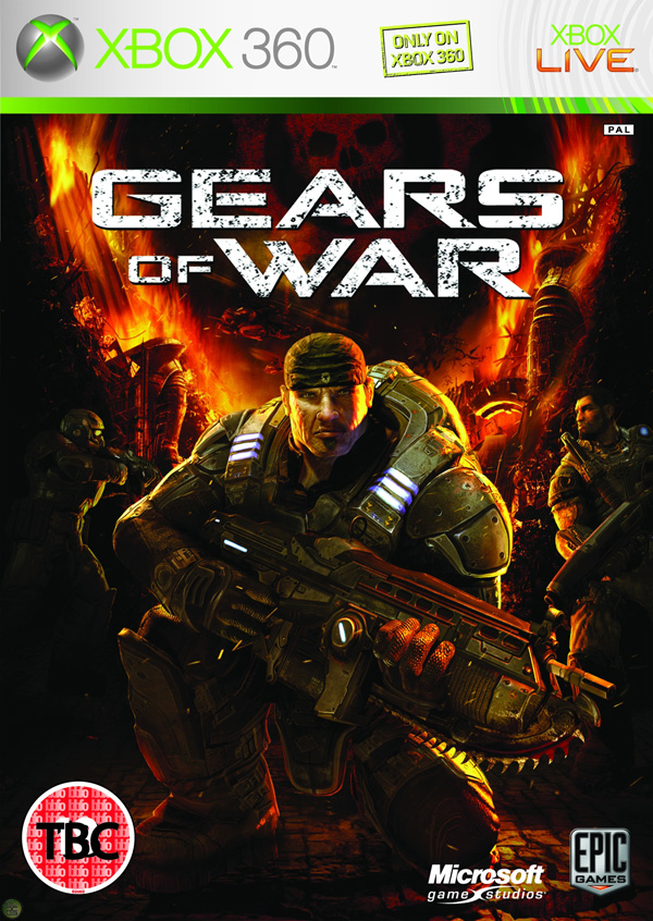


31. Gears of War

While 'armored guy with weapon' is a front-cover cliche, this one stands apart from the pack by virtue of its attention to detail. The characters and even the background setting are meticulously rendered, creating a rich overall image.


30. Jade Empire

The game's regal logo and mythic concept artwork results in a cover that cleverly represents this oriental fantasy game. The cover offers a whirlwind introduction to a genre with few precedents.


29. Sins of a Solar Empire

The cover's brilliant blue at the bottom contrasted with solar red at the top focuses attention on the game's striking logo.


28. Elder Scrolls IV: Oblivion

While the cover art isn't flashy, it's remarkable for its clever use of texture. The design appears to be rendered on an ancient, fraying canvas. The game's cover entices you to touch it.


27. Deus Ex

This cover is note-worthy because of the way it uses color and representative imagery to perfectly capture the mood of the game.


26. Alone in the Dark

While the Alone in the Dark games have been re-invented since the first debuted in 1992, the game's covers have retained a remarkable sense of unity, paying homage to the original classic cover design with a modern horror update.


Alone in the Dark (2001)


25. Lego Batman

The 'LEGO' games as a franchise have featured covers that blend established pop culture figures (Indiana Jones, Star Wars characters) with Lego imagery, adding a clever new twist to images we're all familiar with.


24. Mass Effect

A classic space opera cover featuring the BioWare designed Commander Shepherd character. Though you could customize your character's face with a variety of facial modeling features, BioWare's default model was so realistic that it quickly became a representative for a new era in human realism in video games.


23. Little Big Planet

This cover fuses gorgeous hand-made elements with controlled explosions of color.


22. Contra

Another retro title, Contra is renowned for being one of the most difficult games in history. Its cover is remarkable for its clarity of message: "This is a game about being a bad-ass and shooting alien scum!"


21. World of WarCraft

The visual style of this virtual world is part of its branding, and this is portrayed faithfully in the cover art. The gold, circular frame around the central image is carried through the cover art for the expansion packs also, creating unity between each World of WarCraft product.


20. System Shock 2

The image of SHODAN, the game's insane AI antagonist, is one that has become an icon in sci-fi/horror video gaming history.


19. Far Cry

The first installment in the Far Cry series was, at the time, a pioneer in the development of realistic natural environments in games. While other shooters focused on dark corridoors and gloomy, linear areas, Far Cry rendered a lush tropical environment. The cover conveys this perfectly and would have stood out brilliantly against the other dark and clichéd shooters on the shelves.


18. The Sims 2

'The Sims' franchise of games are among the best-selling in history. Here, the graphic designs have cleverly incorporated the 'mood diamond' (an essential part of the games' user interface) into its logo. The figures chosen for the cover cleverly represent the key aspects of gameplay in The Sims 2.


17. BioShock

The BioShock logo is certainly one of the coolest in modern gaming, and the cover art ticks all the boxes when it comes to featuring iconic images from the game: the Little Sister, the Big Daddy, and the water that spills out everywhere. BioShock is all about mood, and this cover captures it perfectly.


16. Half Life 2

Every Half-Life fan recognizes the distinctive face of Gordon Freeman, the game's silent hero. Though the game features many stunning visuals that could have been used to represent it on the cover, the designers cleverly simplified down to Half-Life's most distinctive image.


15. StarCraft

Alien eyes stare out at you from the cover of the original StarCraft. The expansion packs unified the visuals by featuring different exotic faces on their respective covers.


14. Pokemon Blue

The Pokemon games for Game Boy were cleverly designed. Call the game a color, feature a Pokemon colored to match the game's title, do the same with the background. It seems simplistic, but for the legions of kids who wanted these games it meant that you could spot who had what Pokemon cartridge from across the playground. The end result were arguably the most memorable Game Boy game covers ever created.
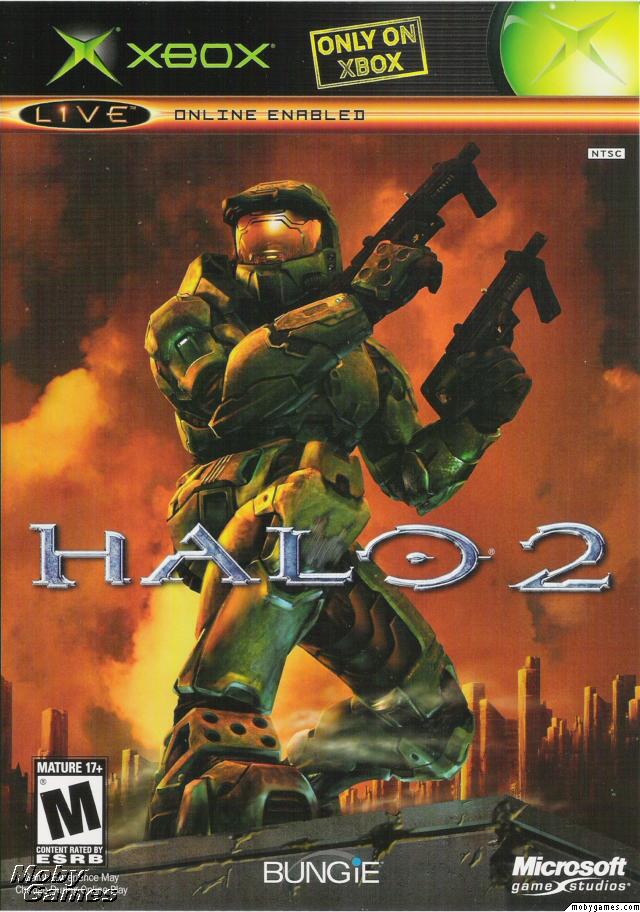
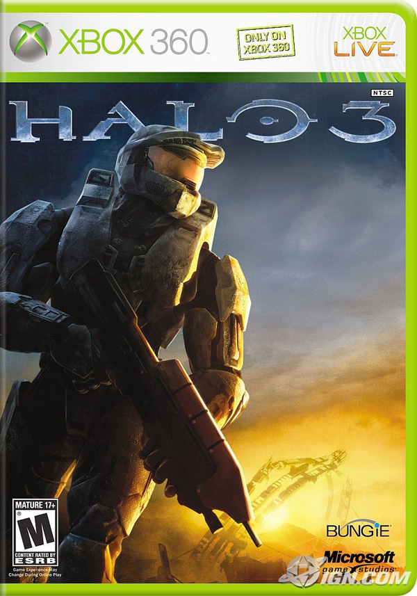


13. Halo

The Halo cover stands out from other first-person shooters with a lush green color scheme. This ties in perfectly with the lush green of Master Chief's combat suit. The Master Chief character has since become a gaming icon and is the center-piece of the covers for the three FPS games in the Halo franchise:


Halo 2


Halo 3


12. DOOM

The DOOM franchise is remarkable for the way the games have, cover-art wise, stayed true to the original. The retro-horror logo and flame engulfed color scheme features right through to 2004's Doom 3. By the time of the game's released the DOOM games were widely-recognized pioneers in the FPS genre and the cover art for DOOM 3 was clever to remind us of this.

DOOM for DOS


DOOM II: Hell on Earth


DOOM 3


11. Super Mario Galaxy

The slick and vibrant graphics of this cover are true to the 'galaxy' setting while also updating Super Mario for a new console and a new era in gaming.


10. Tomb Raider

Every Tomb Raider game, from 1996 to 2008, has featured Lara Croft on the cover. The iconic Lara Croft image has always featured the protagonist in shorts, a singlet, gloves, and wielding two pistols -- so recognizable that the designers behind 2008's 'Tomb Raider: Legend' were confident you'd be able to recognize Lara even with her face obscured. The only deviation? 2000s 'Tomb Raider: Chronicles', where Lara is wearing some kind of freaky black body-suit. Nine years on that cover sticks out like a sore thumb, but the others have helped keep the iconic Lara image alive.

Tomb Raider (1996)


Tomb Raider: Legend (2008)


9. Final Fantasy X

Final Fantasy is one of the most successful game franchises in history. Its covers hinge around a Final Fantasy logo backed by a chromatic illustration of key themes/characters from the game. The logo is simple, yet the chromatic element provides enough interest for the game cover to feature nothing else but a white background. While there are many variations on this theme, the Final Fantasy X cover demonstrates the power of this simple logo to its best effect.


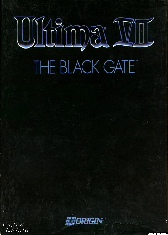
8. Ultima VII: The Black Gate

Once you've reached the 7th game in a franchise, people know what 'Ultima' means. That's why when your game is called 'The Black Gate', you can afford to have a black cover with nothing but your logo on it. This brilliantly under-stated design allowed the Ultima brand to speak for itself: a clear statement of self-confidence. The game is widely regarded to be the best in the Ultima franchise and one of the best RPGs of all time.


7. Mortal Kombat

The encircled dragon logo has featured on the cover of every single Mortal Kombat franchise game ever released. It's a brilliant icon that captures the spirit of the game. Of all the covers featuring this logo, the first is arguably the best: featuring the dragon logo, the game title and its distinctive red, yellow and black color scheme, the cover is an example of powerful graphic design that simplifies the subject down to its essential elements.


6. Metal Gear Solid 4: Guns of the Patriots

In a large franchise like MGS, it's essential that each game cover ties together with other installments in the series. Except for the original Metal Gear Solid for PlayStation (1998), each cover has featured key characters illustrated in manga style, emphasizing the game's Japanese roots.


5. Grim Fandango

The imagery of Grim Fandango, with its art deco style and skull-headed characters, was always going to make for a striking cover. The game's warm colors, mysterious characters and old-school intrigues are brilliantly portrayed in this movie-poster style game cover.


4. The Legend of Zelda: A Link to the Past

The sword, shield and red 'ZELDA' logo have become pop-culture icons. In the limited size environment of an SNES game cover, it's best to stick to what matters. That's what the designers have done here. Even the background color choice -- gold --helps to communicate that the game is a fantasy journey.


3. Super Mario Bros.

The first in a franchise of dozens, this cover marks the beginning of the iconic 'Super Mario' image. While Mario has been depicted in many different ways since this game's release in 1985, Mario in all his pixelated glory has remained the most recognizable.


2. Half-Life 2: The Orange Box

The Orange Box cover design doesn't feature complex Photoshop techniques and over-complicated imagery, and that's what makes it great. It stands out on game store shelves and in your own collection due to the bright 'safety' orange of the plastic and cover and iconic imagery representing the content in the package: Gordan Freeman's face representing Half Life 2, the portal symbol, and one of the distinctly recognizable characters from Team Fortress. The unique branding has also allowed Valve to tie this in with Half-Life 2's web presence at orange.half-life2.com.


1. Grand Theft Auto IV

The legendary Grand Theft Auto games utilize a design theme that is recognizable from across the room. Covers feature split section artwork capturing the characters and scenes you'll find inside the game, all illustrated in a distinct style by Ian McQue, lead concept artist at Rockstar North. The GTA logo with its iconic type-face has been consistent since Grand Theft Auto III. What's special about the cover design is that it focuses on what makes the Grand Theft Auto games great: the characters.


If you were entertained by this post, tip your hat by voting for it on Tob!dah.com :)

thanx Skellie